Tools for Website Accessibility
- WAVE Web Accessibility Tool
Test your web page for accessibility - Color Contrast Checker
Find ideal ratio for text to background color - PDF Accessibility Checklist
Lists requirements for making PDFs accessible - W3C’s Web Content Accessibility Guidelines
MCPS websites must comply with these standards - WAI-ARIA 1.0
MCPS websites must comply with these standards for Accessible Rich Internet Applications - Photosensitive Epilepsy Analysis Tool (PEAT)
Test whether your flickering multimedia elements can cause seizures - Editing Captions in YouTube
Instructions on how to edit the automatic captions provided by YouTube
Americans with Disabilities Act (ADA) Compliance
Section 508 of the Rehabilitation Act requires federal agencies to make websites accessible to people with disabilities. As an institution that receives federal funding, Montgomery County Public Schools must adhere to the guidelines set by section 508 to provide equal accessibility to disabled users.
How to Ensure Your Web Pages are ADA Compliant
Tips for Webmasters
As a school or office webmaster, most of the groundwork for making your website ADA compliant has already been set in the template. Now all you have to do is maintain it. Here are some tips to ensure your web pages are accessible:
1 - Use ALT tags for images
Example
Appropriate ALT Tag:
<img src="/siteassets/district/departments/web/slide3.jpg" alt="smiling elementary school students in hallway">

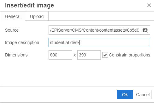
Creating Alt Tag in Epi Content Editor
When you upload an image via the (Epi) editor into a content block, you will be prompted to enter an "image description" for the image. This description will become the ALT tag, used by screenreaders in place of the image for the visually impaired. Do your best to make it as descriptive as possible.
Creating Alt Tag in Media Assets Pane
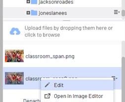
When you upload an image directly to the media assets pane, you will need to click to edit the image after uploading it. Make sure you are in Properties view, and then add the image description to the Alt field.
Step 1 - Upload image to media assets pane and then click menu > edit on the image.
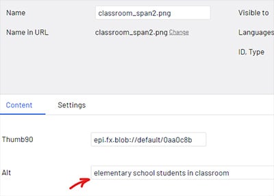
Step 2 - If you are not already in Properties view, switch to Properties view in the top right corner.

Step 3 - Enter a descriptive name in the ‘Alt’ field.
2 - Use contextual and descriptive text for links
If your link text is not descriptive, you must include a link title. When using the Epi editor, whatever you enter in the "Link Title" field on the Insert/Edit link option will become the link title for screenreaders.
Example
How to enter a link title in Epi: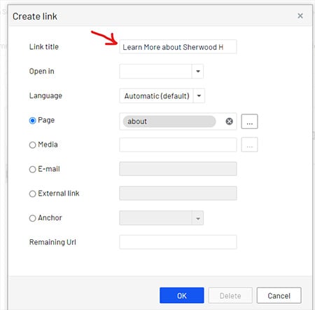
Either of these is ADA compliant:
<a href="/schools/sherwoodhs/aboutus/" title="Learn More About Sherwood High School">Learn More<a>
OR
<a href="/schools/sherwoodhs/aboutus/">Learn More About Sherwood High School<a>
3 - Don't rely on color alone to convey important information
A disabled user – for example, someone with color blindness – might not be able to differentiate between red and another color. So don't rely on color alone to make something stand out. Try bolding the text or making it a larger font as well.
Example
INCORRECT
Emergency Message: School is Closing Early Today.
CORRECT
Emergency Message: School is Closing Early Today.
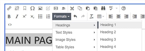
4 - Use h1, h2, h3 and h4 tags for your headers
Provide true semantic headers (h1, h2, h3, h4) to help those using screenreaders. This will help improve the user's experience when navigating through a site.
EXAMPLE
<h2>Main page heading</h2>
<h3>Subheading 1</h3>
<h4>Subheading 2</h4>
Apply Heading Styles with the Epi Editor
5 - Use text, not images, in page titles and navigational elements
A text reader may not be able to read and interpret the images for disabled users.
6 - Follow standards for making PDFs ADA Compliant
PDFs are not automatically screen-reader friendly. PDFs should contain searchable text, not text embedded as images. They should include alt text, logical reading order, clear headings, easy-to-read fonts, and hyperlink descriptions.
Here are some tools for creating and verifying PDF accessibility: How to Make a PDF Accessible
7 - Do not use tables for general page layout
Not only do tables used for layout make pages render incorrectly on mobile devices, they also create problems for screenreaders.
8 - When using tables to present data, use row and column headers
For data tables, you must include row and column headers. Visually impaired users are unable to ascertain the contextual clues (such as color highlighting) that might indicate a table has a header row.
For examples and instructions, see this tutorial on making data tables accessible from the Department of Veteran's Affairs.
9 - Make sure videos include captions
Captioning is necessary for people who are unable to hear the audio in a video. You can find numerous software programs online to caption your videos. YouTube provides automatic captioning, and can be embedded onto a Epi web page. The automatic captioning provided by YouTube may be inaccurate, so you need to edit the captions in YouTube before embedding the video.
10 - Make sure contrast between text and background color is sufficient
Users with low vision and color blindness may have difficulty reading documents that do not present sufficient contrast. The color contrast ratio between background and text should be at least 4.5:1 for normal text and 3:1 for large text. You can use this color contrast checker tool to determine the ratio.
Example
INCORRECT
Make Your School Payments Online
CORRECT
Make Your School Payments Online
11 - Do not post blinking, flashing, or flickering elements
Make sure your video, animation, or other multimedia product does not contain flashing, strobing, or flickering elements within a frequency greater than 2 Hz and lower than 55 Hz, as they can cause some people to experience seizures, dizziness, and nausea. You can use the PEAT Tool to see if your content falls in these ranges.
Web Services Guidelines for Making Templates Accessible
Developers in Web Services follow these guidelines for making accessible web page templates.
1 - Include a link to skip the navigation
This allows users of screenreaders to jump to the main content on each page without having to listen to all of the main menu links each time they open a new page.
2 - Ensure site can be navigated with a keyboard
Design a site to ensure it can be navigated with keyboard controls for people who cannot hold a mouse.
3 - Design Accessible Forms
When creating forms or interactive elements, use a tabindex to define the logical progression of steps. Make sure you label form elements carefully, placing the text labels close to the controls.
4 - Content on site should be available with CSS and JavaScript disabled
Web pages should be readable without requiring an associated style sheet. If you are using hidden content exposed with JavaScript event handlers, make sure that either equivalents are available without JavaScript or that you can trigger the event handlers with the keyboard.
5 - Make sure user can adjust font size to his/her preferences
Use relative units for font sizing, such as em or percentage instad of pixels. Most modern browsers include font sizing for those who may need to see text at a larger size.